In this post, we take a deeper dive into one of our free trial datasets, NYC taxi. The original data is from the NYC taxi commission who publish their data here:
The dataset is really simple, with only two columns – a timestamp and a count of taxi trips. There is a timestamp for every half hour interval. The data spans the seven months from Jul 2014 to Jan 2015 and contains just over 10,000 records. If you go through our free trial, you can get both the data profiling report and the outlier results for this dataset.
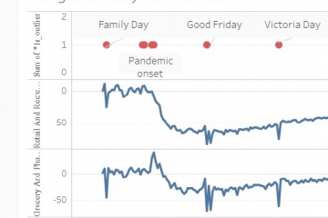
In the outlier results, the outliers are ranked from 1 to 310, with 1 being the biggest outlier. The first and simplest thing to do with the results is to sort by the ranking and take a quick look. We have annotated these results with events that were happening on those days and this provides some confirmation that the outlier detection is on the right track.

Since this data is a time series, it makes sense to view the data in date order. We have imported the outlier results dataset into Tableau to create a visualization. At the bottom of the visualization is the whole time series and this is a very busy picture. But if you use the slider above the whole dataset, you can choose a two week period to zoom into.
Let’s start by selecting a zoom period that contains no outliers, two weeks in October. You can see how regular the demand for taxis is during this period.

Next, let’s zoom in on 1 January. Here we can see the cluster of high ranking outliers in the early morning of New Year’s Day when demand was high. There are more outliers in the next few days, but their ranks are not nearly as high i.e. they are much less important.

Next, let’s zoom in on 2 November. There are only two high ranking outliers in this period and they correspond with a spike in demand for taxi trips in the early morning of Sunday, the day of the New York City marathon. Perhaps a late night out enhances a runner’s performance the next day?

Finally, let’s zoom in on 26 January. There are many outliers during all of January, and these are probably weather related. In fact, 70% of outliers found in this dataset were in January.

At Penny Analytics, we have lived in NYC and January is cold and unpredictable. We are now in Toronto and it’s no better! Anyway, the highest ranked outliers are clustered together late at night on 26 January, when demand was extremely low. According to Wikipedia, at that time the storm on the east coast was significant and predictions were for between two and three feet of snow in New York City. In fact, the snowfall turned out to be less than that but the weather forecast itself would have affected demand for taxis.
January_2015_North_American_blizzard
So, that was a fun demonstration of outliers we found in a time series, but it’s time to get practical. This demonstration was a bit like a car advertisement containing “professional driver on a closed course”. (Well, at least the closed course part is right.) As we said at the beginning, the NYC taxi dataset is very simple.
What if your dataset contained several time series? Our outlier detection service can process 200 columns of data, although if each one of those columns were time series the effective limit is more like 40. Even so, 40 time series is really hard to visualize. Our system finds the records/dates that are outliers, and gives reasons why, which could be several. For example, an outlier in a more complicated dataset could look like this:
1 January 2019 12:00:00 – taxi trips low, shopping receipts low, TV viewing high, aspirin consumption high
So, this leads us into use cases. Let’s probe a couple of use cases and suggest some practical responses to those.
I work in devops and I have 40 metrics that are collected every five seconds. I do not require real time alerts, but I do need a daily analysis done and I only intend to action anomalies from the last day. The rest of the historic data I’m giving to you is just to establish a baseline.
In this case, metrics are being collected at a rate of 12 per minute which adds up to 17,280 a day. The Penny Analytics outlier detection service will rank 3% of records as outliers. So, if your day is typical, that is 518 outliers – lots! If your day is like a blizzard in January, it could be higher. The good news is that we think many of these outliers are likely to be clustered around a smaller number of events.
Our method here would be to take the Penny Analytics outliers file and first just keep the records you want to action, those from the last day. Next, create a new column called group and scroll through the records to find groups of outliers. For each outlier record, assign it a group along with any adjacent outliers that have similar reason codes. You can think of these groups as single events. Then create a pivottable and calculate the minimum rank, average rank and record count for each group. The rank assigns the priority to each event and events with smaller ranks are the most important. Use something like this to form your priority list for the day.
We did this for the last two weeks of the NYC taxi data and we reduced 130 outlier records to 16 groups (16 events).
I’m a data scientist/data engineer and I need to find the outliers in my time series dataset, so that I can make decisions about them prior to building forecasting models.
This is a good use of outlier detection and by focusing on the highest ranking outliers you can make the greatest improvements to your models. Outliers provide clues about where your forecasting could go wrong. For example, if we were now building forecasting models for NYC taxi trips, we would think about including special days such as New Year’s and the marathon which are known in advance. We would also need to think about how to handle January. We know that there will be bad weather, we just do not know exactly when it will be. So, perhaps our forecast needs to use other forecasts (weather forecasts) as an input? Or we need a dataset over several years so that we can model those monthly seasonal patterns better. If that is not possible, we might simply need to use our January forecasts more cautiously, because we know they will not be as reliable as other months.
What about anomalous events that are explainable but unlikely to be repeated? From time to time there are near riots in cities because an Ikea opens or a Costco opens or something like that. In situations like these, you might want to smooth over the anomalous records before including them in modelling.
If you haven’t done so already, please run the NYC taxi dataset through our free trial.
Also, you can play with the NYC taxi visualization yourself by going to our pages in Tableau Public.